

UI / UX Design
User Experience & Interface Design
Every extra tap costs you a customer. We design the shortest path between what the user wants and what you want them to do.

Service Overview
Design tested on users, not judged on taste
We start from the question that settles everything: what task did the user come to accomplish? We map its current path, count the steps that can be removed, then rebuild the interface around that task instead of building pretty, disconnected screens. We deliver a complete design system: components, states and usage rules, with an interactive prototype tested on real users before development. The result is a design with less confusion, a shorter task-completion time, and every screen measured by a number. And we design for all people, not just owners of ideal devices: sufficient contrast, comfortable touch sizes, and a clear order that serves both those who see with difficulty and those in a hurry. Accessibility isn't an extra feature — it's part of the design quality itself. And for us a design isn't handed over as an image file, but as a system your team works on: a documented component library, every screen's states, and the reason behind every decision — so the experience stays coherent no matter how large the product grows or who works on it.

Every design decision has a written reason
We do not design a screen because it is pretty — we design it because it settles a decision for the user or serves a clear metric. Every major choice is documented with its reason and rejected alternatives, so months later your team knows why it was built that way — and knows when changing it is justified and when it is just dismantling what works.

A decision log documented with reasons and alternatives
Testing on real users before development
Before-and-after numbers proving each change
Benefits

Fewer steps to done
Every screen that does not serve the task is removed and the difference is measured — the shorter path is drawn, not guessed.

Tested with real users
Observed sessions with users from your own audience reveal the point of confusion before it costs you weeks of development.

A design system you reuse
Shared components with their rules and states speed up every new screen and keep the look from fraying over time.

Contrast and clarity for everyone
Sizes, colours and spacing that follow accessibility standards — design serving the user who sees poorly as well as the one who sees well.

A prototype before development
You try the product as if it were real and approve the whole flow before any build cost — the decision before the invoice.

A handover developers can build from
Tidy files with sizes, states and libraries, so the design is never reinterpreted by each developer's own guess.
Service Highlights
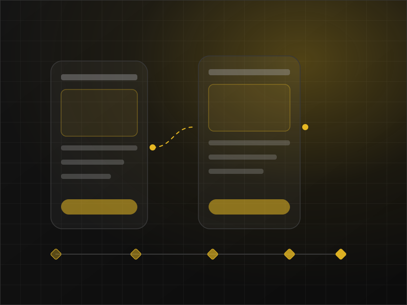
From the flow to the screen
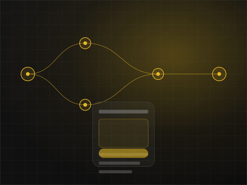
We draw the journey step by step from entry to task done, then design only the screens that serve it — a screen that serves no decision is never drawn and never paid for.
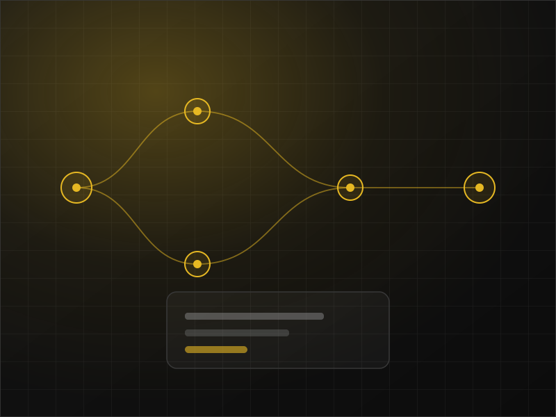
A design system, not a pile of pages
Documented colour, type, components and states with clear usage rules, so adding a feature months after launch stays faster, cheaper and more consistent.
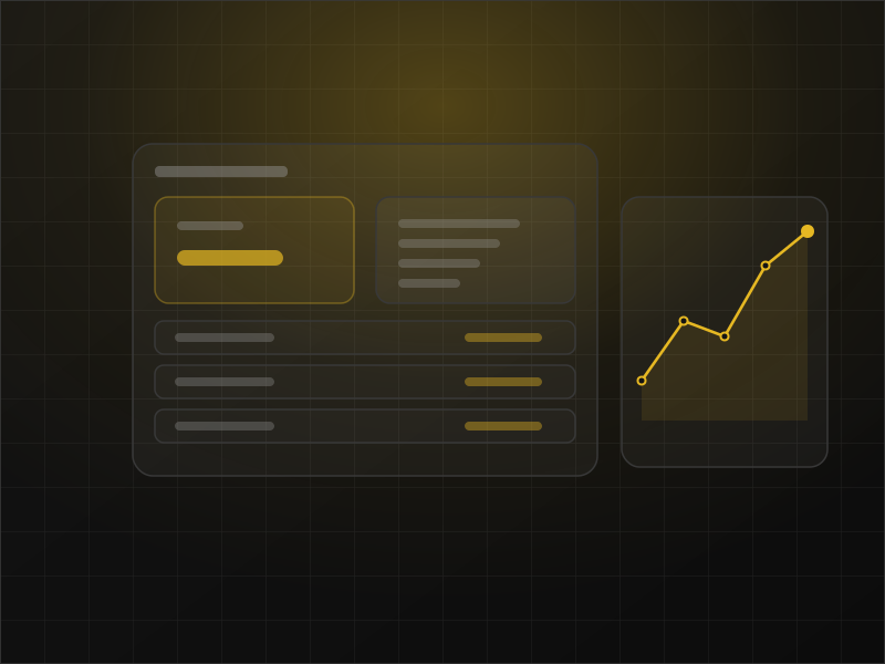
Measured before and after
We agree on measures like time to finish and drop-off at each step, and read them before and after — so the effect is a number we prove, not an opinion we defend.
Users do not read your interface… they scan it for the next step.
A deeper look
Beautiful design is only half the answer
What the service includes
User research and usage-data analysis
Journey maps and clear user flows
Low-fidelity wireframes for every flow
High-fidelity interfaces for every screen
A component system documented with its states
A clickable prototype you can walk through
Usability testing rounds
Tidy, developer-ready handoff files
How It Works
Research and the job to be done
Interviews and usage data to find what actually blocks people.
Flows and structure
Journey maps and low-fidelity layouts for every main screen.
Interface and prototype
High-fidelity design, a component system, and a prototype you can walk through.
Testing and handover
Test sessions, fixes for what they surface, then a tidy handover to the developers.
Examples from our projects

Every tap in your product costs something — make it count
Tell us where your users stumble today, and we will propose the first flow worth redesigning.
